Greenhouse Creative brings the eco-friendly, sustainable mattresses of NZ company, Fullair, to life with their judicious and personalised branding strategy.

The Brief
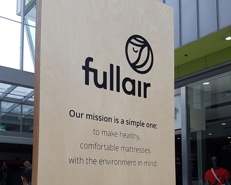
A proud New Zealand company, Fullair needed a look that visually represented their philosophy – to make mattresses with the environment in mind.
With a passion for the environment and our country’s beautiful landscape, Fullair wanted to change the unsustainable rate of mattress waste being dumped into NZ’s landfills each year (over 300,000!).
With innovative technology and a focus on sustainable practices, Fullair makes eco-friendly mattresses that don’t compromise on comfort. Inspired by the beauty and simplicity of nature, each of their mattresses contains 90% air.
Fullair asked Tonia at Greenhouse Creative (formerly Crisp Graphics) to take on the challenge of creating their brand image. The brief was simple: create something BOLD and that Kiwi’s will relate to.

The Response
Though Fullair initially wanted to go for a bold, in-your-face look, Tonia felt that the vibe didn’t quite fit with the company’s values. Upon digging deeper and considering Fullair’s target audience, Tonia realised that the important concepts needing to be presented were Fullair’s sustainability and eco-friendly philosophy.
Tonia identified that the brand needed to balance the following three key elements:
- The weightlessness of the mattress (air/clouds/dreams) versus the heaviness of sleep
- The ease of sleep versus the burden on the planet
- The roundness of earth and comfort combined with the notion of recyclability and sustainability

Tonia also understood the importance of providing quality written content for the project. She partnered with digital copywriting company, BizStory Content, to refine Fullair’s story, capture their voice, and deliver the right message.
The final logo and palette that Greenhouse Creative presented to Fullair incorporated the following elements:
- Sustainability/eco-friendly
- Sleep
- The juxtaposition between yin and yang
- The shape of planet earth
- Recyclability and the cyclical nature of the purchasing decision
- Feelings of virtuosity
- The abstract shape of the letter ‘F’ to acknowledge the business name
- A depiction of the crescent moon
- The symbolism of wind or air

Tonia wanted to capture the cyclical nature of the relationship between customer and earth. Beginning with the customer making virtuous purchasing decisions, the cycle continues on to making them feel good. Feeling good leads to great sleep, great sleep leads to feeling good, and feeling good leads to making virtuous purchasing decisions.
The logo represents the yin and yang concept of dualism, an idea born from ancient Chinese philosophy that describes how seemingly opposite or contrary forces can actually be complementary. The use of this concept ultimately reflects Fullair’s vision of a people and planet in harmony – a better sleep and a lighter footprint.

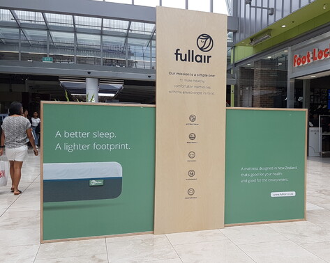
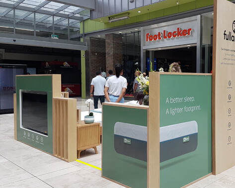
Greenhouse Creative’s work with Fullair has since evolved into a larger ‘Phase 2’ project.
This has seen Tonia helping with new elements, from coordinating a photo shoot and putting together a portfolio of product images to designing the posters, interior space and customer experience room for an upcoming pop-up store in Sylvia Park.
“Working with Tonia was a really simple process. After only one initial brief, she was able to accurately capture the essence of our brand, designing a look that related back and genuinely represented us.
All of our feedback on her design is positive – we love it!”
- Chris Wang, owner of Fullair

Design
+ Brand clarity
+ Brand strategy
+ Digital strategy
+ Marketing strategy
+ Digital systems & toolbox
Cultivate
+ Ecommerce
+ Landing pages
+ Digital marketing
+ Google adwords
+ Social media marketing

